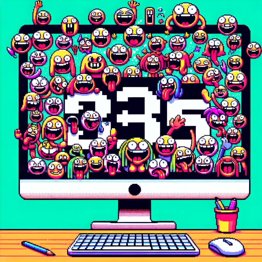
Why stupid screenshots still make me laugh (I don't know why, they just do.)
I’ll admit it: I belong to a small but devoted audience of ridiculous screenshots. You know the ones — a terrible product photo, a well-meaning autocorrect catastrophe, a Wi‑Fi network name that doubles as performance art. They are gloriously dumb, and somehow they keep getting funnier even after the tenth scroll. BuzzFeed recently rounded up 36 of these gems, and reading through them felt like a nostalgic, chaotic snack for the attention span. I don’t know why — they just do.
What’s going on here
Screenshots are tiny time capsules of internet life. They capture:
- accidents (autocorrects, wrong-pane replies),
- low-effort creativity (wildly specific Wi‑Fi names, paint-job hacks),
- and social media confidence that defies common sense (public tantrums, oddly cropped selfies).
Because they’re short, immediate, and often unintentionally honest, screenshots let us witness human weirdness in high definition. They’re also shareable: one screenshot becomes a meme, then a joke, then a running reference in group chats. The BuzzFeed collection curates that tiny museum of digital face‑palms — the kind that are so dumb, their only crime is to be extremely, consistently entertaining.
Why they keep getting funnier
- Surprise beats polish. The funnier screenshots are usually unpolished — an unexpected phrase, a bizarre image crop, or a clueless caption. That element of surprise triggers quick, visceral laughter.
- Relatability = repeat value. Many screenshots reflect tiny public humiliations or everyday fails. Recognizing yourself (or someone you know) in them makes the joke land again and again.
- Social amplification. Once a screenshot lands in a shared space (Twitter/X, Reddit, Instagram), it gets annotated, remixed, and reposted — every pass layers new humor on top of the original.
- Low friction to consume. A single image or a short thread can be understood in seconds, making it perfect for rapid, repeat enjoyment during idle scrolling.
Highlights from the roundup
BuzzFeed’s list (reposted in several outlets) pulls from Instagram, Reddit, TikTok, Facebook, and random screenshots people captured in the wild. A few recurring archetypes stood out:
- Autocorrect disasters that turn earnest messages into comedy gold.
- Product photos or ads that missed the mark so badly they became surreal.
- Wi‑Fi names and public notices that read like tiny, bitter essays.
- Group‑chat exchanges that go off the rails and become unintentional improv.
Each category hits a different comedic nerve — absurdity, embarrassment, squinty suspicion at human logic — which explains why the list doesn’t feel one-note.
Internet culture context
The screenshot is a core building block of meme culture. For a decade (and more), screenshotting has allowed users to preserve fleeting content (stories, disappearing messages, ephemeral tweets) and repurpose it. That preservation habit is partly why compilations like the BuzzFeed piece resonate: they gather ephemeral nonsense into an archive that rewards re‑visitation.
There’s also a design angle: modern social platforms reward quick, image‑first content. As the signal-to-noise ratio of the web tips toward brevity, those bite‑sized absurdities shine even brighter. And because platforms are full of earnest, imperfect people, the supply of “ridiculously stupid” material is effectively endless.
A few lessons from the absurd
- Humor is democratic. You don’t need a polished joke; you need a genuine, small moment.
- The more weirdly specific something is, the more universal it can feel. A Wi‑Fi name typed by someone in Ohio can be hilarious to a stranger in Tokyo.
- Community context matters. Screenshots often need the right audience — a group that shares the sensibility — to reach peak funniness.
Little things that make a big laugh
- Autocorrect: it’s the gift that keeps on giving. A single misremembered word can reframe the entire message.
- Bad product photos: when an image promises one thing and delivers another, the dissonance is delicious.
- Embarrassing public posts: humans are confident and chaotic. Seeing that collision recorded in pixels is pure entertainment.
My take
I don’t think there’s anything inherently noble about collecting other people’s dumb moments — we should be mindful of context and privacy. But when the screenshot is shared publicly (a public Wi‑Fi name, a posted image, a public social feed) and it’s ridiculous in an innocuous way, it’s a kind of tiny communal joke. I love that something so small can make dozens of strangers giggle at once. It’s a reminder that the internet’s best moments are often accidental.
Things to remember while you laugh
- Respect boundaries: don’t share private screenshots without consent.
- Laugh with, not at, when possible. Some of the best humor comes from shared embarrassment, not cruelty.
- Enjoy the little absurdities. They’re free, fleeting, and sometimes the best part of a commuter ride or a coffee break.
For the curious
- The list that inspired this post collected screenshots from Instagram, Reddit, TikTok, Facebook, and other corners of the web and shows how everyday weirdness becomes collective amusement.
- Why do they keep resurfacing? Because human messiness is an inexhaustible resource for short, sharp laughs.
Final thoughts
Ridiculously stupid screenshots are an internet comfort food: quick, comforting, and reliably satisfying. I don’t know why they hit so hard — maybe it’s the shared recognition of human fallibility, or maybe our brains are just hardwired to enjoy small surprises. Either way, they keep coming, and I’m glad they do.
Sources
-
36 Ridiculously Stupid Screenshots That Get Funnier And Funnier And Funnier And Funnier And Funnier And Funnier No Matter How Many Times I've Seen Them — Yahoo Lifestyle (repost of BuzzFeed content).
https://au.lifestyle.yahoo.com/36-ridiculously-dumb-screenshots-just-160924631.html -
36 Ridiculously Stupid Screenshots That Get Funnier And Funnier — discussion repost.
https://mirtesen.ru/dispute/43071251715/36-Ridiculously-Stupid-Screenshots-That-Get-Funnier-And-Funnier-
Related update: We recently published an article that expands on this topic: read the latest post.