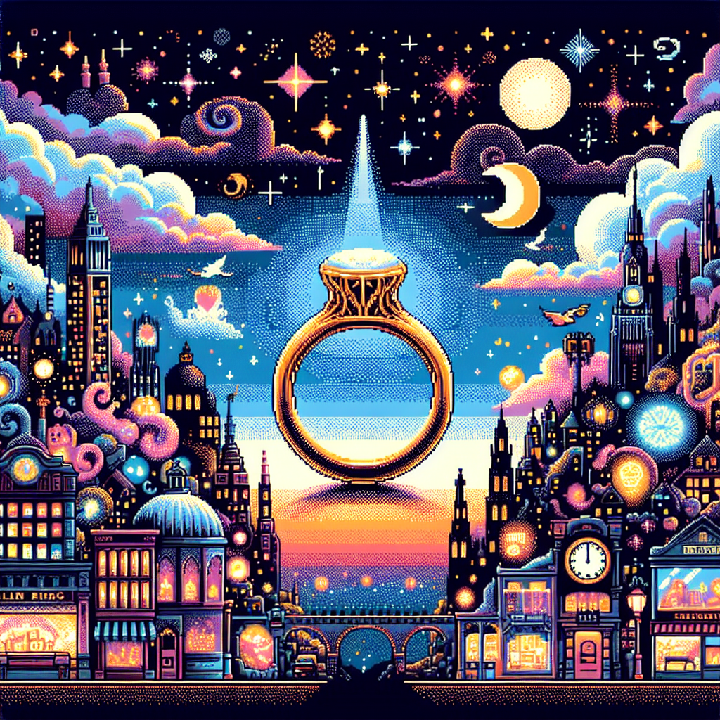
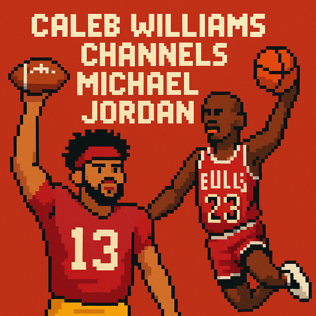
Ravens’ Next Flight: Sleek Helmets, Bold | Analysis by Brian Moineau

A new look for Baltimore: The Next Flight takes off

The Next Flight uniforms introduce two new helmets and several sleek changes in the details. The Ravens’ long-awaited refresh landed like a thunderclap: not a total reinvention, but a confident evolution—cleaner lines, bolder accents and a pair of helmets that immediately dominated the conversation. For a franchise that’s worn purple and black for 30 years, that’s precisely the kind of change that gets fans’ hearts pounding and wardrobes updating. (baltimoreravens.com)

Why this matters beyond the colors

Uniforms do more than clothe players; they tell a franchise’s story. The Ravens leaned into motifs tied to Baltimore—wings, talons, and subtle flag references—while preserving the identity that worked on the field and in the stands. The result feels intentional: familiar at a glance, but with details that reward a closer look. The club said the process took years, and you can see that in the layered touches and refined typography. (baltimoreravens.com)

The Next Flight uniforms: helmets, jerseys, and details

  • Two new helmets headline the collection: a matte-black “Darkness” helmet and an updated metallic-purple “Purple Rising” shell. The Darkness helmet features black talon stripes and a forward-facing raven logo with red eyes, designed to pair with the all-black alternate uniform. The Purple Rising helmet adapts previous alternate elements into a cohesive primary look. (baltimoreravens.com)
  • Jersey tweaks include an updated number font with a midnight purple stroke, iridescent accents inspired by raven feathers, and a collar pattern that echoes a raven’s wing spread. The white jerseys now display “Baltimore” across the chest, giving the road set a local stamp. (nbcsports.com)
  • Pants and stripes received subtle adjustments: talon stripes appear across pant varieties, and shield patches incorporate iridescent color that shifts in light—small touches with big visual payoff under stadium lights. (baltimoreravens.com)

Transitioning from the familiar to the fresh, the Ravens balanced novelty with continuity.

The helmets: the real conversation starters

Helmets always carry outsized weight in uniform reveals, and Baltimore delivered two distinct personalities. The Darkness helmet is aggressive and theatrical—matte black, understated striping, and a front-facing logo meant to read menacingly when players emerge from the tunnel. The Purple Rising helmet keeps the metallic sheen introduced earlier in recent seasons, but now more firmly ties into the primary identity. Fans and analysts have already split between calls for classicism and praise for the bold alternate look. (nfl.com)

What fans are saying (and why reactions are mixed)

  • Some fans love the Darkness helmet and the all-black combo, saying it’s the kind of showpiece alternate that energizes gamedays.
  • Others worry the dark-on-dark logo work may get lost visually, especially on TV, and miss bolder contrast or a return to retro flourishes.
  • Many applaud the subtle iridescence and the “Baltimore” script on the white jerseys—small choices that speak to place and craftsmanship. (reddit.com)

The truth is in perspective: the design is conservative by modern rebrand standards but smartly detailed. It’s not shock-and-awe; it’s curated refinement.

Where this fits in NFL uniform trends

Across the league, teams are increasingly exploring alternate helmets, metallic finishes, and localized wordmarks. The Ravens’ rollout mirrors that trend: alternates designed for spectacle, with primary sets that maintain brand equity. The NFL’s relaxed rules about helmet combinations have emboldened teams to mix-and-match helmets and jerseys, and the Ravens clearly built flexibility into the Next Flight collection. (news.sportslogos.net)

Design wins and potential stumbles

  • Wins:
    • Cohesion: colors, logos and textures feel purposefully aligned.
    • Detail: iridescence and collar patterns reward fans who study the kit.
    • Theater: the Darkness helmet and “all-black” look deliver visual drama. (baltimoreravens.com)
  • Risks:
    • Contrast: black logos on black helmets may lack pop under some lighting.
    • Expectations: some supporters hoped for a bolder break from past designs and may see the refresh as incremental. (reddit.com)

How the team framed the collection

The Ravens called the project “The Next Flight,” a nod to both legacy and forward motion. Their messaging emphasized history—references to earlier logos and local motifs—while spotlighting the next era on the field. The reveal at a fan-focused event emphasized community, suggesting these uniforms aim to resonate beyond TV shots and into the tailgate culture. (baltimoreravens.com)

What this means for merchandise and culture

Expect a surge in alternate-helmet-related gear and a steady demand for refreshed jerseys. The Darkness helmet and all-black combos tend to sell well; they also create collectible moments. Over time, small design elements (iridescent strips, new font treatments) can differentiate authentic fan gear from knockoffs, and they give players and broadcasters new visual cues that can become iconic. (sports.yahoo.com)

Takeaways for casual and die-hard fans

  • If you want statement pieces: the Darkness helmet and matching kit are the ones to watch.
  • If you prefer classic Ravens iconography: the primary purple set mostly preserves the familiar silhouette with improved detailing.
  • If you collect jerseys: look for alternate drops that highlight the iridescent and talon stripe elements—those are the design signatures that define this era. (baltimoreravens.com)

My take

The Next Flight feels smart because it respects what worked while giving fans new focal points. It’s not a radical rebrand—and that’s part of its charm. The Ravens kept their visual DNA intact and layered in theatrical elements that will age well when used thoughtfully (think playoff nights at The Bank). The boldest gamble—the matte black Darkness helmet—is exactly the kind of polarizing move that can either become a cult classic or a short-lived fad. Either way, it’s exciting to watch a franchise with a strong identity choose refinement over reinvention.

Final thoughts

Uniforms are a language fans speak; small tweaks can feel like major personality shifts. The Ravens’ Next Flight collection walks a fine line between honoring history and creating spectacle. Whether you cheer the Darkness helmet or miss older flourishes, this reveal gives the team new chapters to write—and new looks to win in.

Sources


Related update: We recently published an article that expands on this topic: read the latest post.


Related update: We recently published an article that expands on this topic: read the latest post.

Kornet vs. Magic City: Atlanta’s Meme | Analysis by Brian Moineau

A night that became a meme: Luke Kornet vs. Magic City Night

It started as a quirky local promotion and quickly ballooned into a national talking point — Luke Kornet vs. Magic City Night became the most unexpectedly absurd NBA beef of the year. What was supposed to be a tongue-in-cheek tribute to an Atlanta institution turned into a controversy involving players, former Hawks legends, and ultimately a decision from Adam Silver’s office to cancel the event. The whole thing feels equal parts cultural wrestling match and late-night internet theater.

How a local idea went nuclear

The Atlanta Hawks announced "Magic City Night" for their March 16 game against the Orlando Magic: limited-edition merch, the club’s famous lemon-pepper wings (Lou Williams has a history there), and a halftime performance by T.I. The team framed it as celebrating an “iconic cultural institution” in Atlanta. On paper it read like another city-night promotion — until it didn’t. (theringer.com)

A few days later, Spurs center Luke Kornet posted an open letter asking the Hawks to cancel the promotion. Kornet argued that putting a strip club on the same program as an NBA game “reflects poorly” and risks objectifying women, asking the league and team to rethink the optics. His missive spread fast: social feeds, sports sites, and opinion columns picked it up, and even Hawks favorite Al Horford publicly agreed. (theringer.com)

Luke Kornet vs. Magic City Night: why this mattered

  • It wasn’t just about a themed night. It was about what the NBA and teams choose to elevate in public spaces where families, sponsors, and broadcast partners intersect.
  • The incident exposed splits in perception: some saw Magic City as an authentic cultural touchstone — tied to hip-hop and Atlanta lore — while others saw it as an inappropriate arena partnership.
  • Players speaking up about non-game matters have become louder and more consequential. Kornet’s blog was an example of a role player using his platform to push the league to act. (theringer.com)

These factors converged into a high-drama, low-stakes spectacle: a single player's essay, a team promotion, and a commissioner’s decision that landed on the national news cycle.

What the league did and why

The NBA said it was responding to “concerns from many across the league” and informed Hawks leadership that the Magic City promotion would be canceled. That statement — handed down from the commissioner’s office — effectively shut down the planned in-arena branding, though some elements (like the halftime performance and wings for sale) were stated to remain in other forms. The cancellation underscored how the league balances local marketing with national brand stewardship and corporate relationships. (apnews.com)

Some observers noted the irony: the NBA acted decisively here while it has been more circumspect on other, arguably bigger controversies in recent seasons. Critics argued the move rang a bit performative; defenders said the league has to be mindful of public optics and player concerns. Either way, the decision revealed how quickly governance, public relations, and social values can collide in pro sports.

The cultural tug-of-war underneath

Magic City isn’t just a strip club to many Atlantans — it’s woven into the city’s music, nightlife, and celebrity lore. For decades, the club has been referenced in rap songs and visited by major artists and players, making it an authentic local emblem to celebrate. Yet, that very embeddedness raises the question: does celebrating a venue with adult entertainment at a family-oriented sporting event cross a line? The split answers show why the debate landed where it did. (theringer.com)

Additionally, the episode highlighted tensions about who gets to define “city culture” publicly. Teams often curate local pride nights (restaurants, musicians, neighborhoods). When the celebrated institution is a strip club, it tests assumptions about normalization, worker dignity, and the messages teams send to fans and partners.

The players, the PR, and the punchlines

The spectacle had all the trappings of an internet-age controversy: a thoughtful blog post, celebrity endorsements or pushback on social media, ticket-price swings, and jokes about booing Kornet at future Hawks games. The Ringer framed it as both ridiculous and revealing — a tiny blog escalating to a commissioner’s office. Humor and skepticism abounded online: some cheered Kornet’s stance; others mocked the whole charade as performative or prudish. (theringer.com)

Yet beneath the memes and hot takes, real people and businesses were affected. Magic City staff, arena workers, and local vendors suddenly found themselves in headlines and apologies. The conversation wasn’t purely theoretical for those with livelihoods tied to the event.

What this says about modern sports culture

  • Teams are cultural curators now. Their promotions are statements about identity and audience.
  • Player platforms are powerful beyond the court. A single well-placed opinion can shape league action.
  • The league must balance local authenticity with national brand and sponsor responsibilities.

This incident acts as a small case study in how sports organizations navigate cultural complexity in a media-saturated moment. It also shows that what seems like a harmless promo can become a proxy for larger social debates.

My take

There’s something funny and a bit sad about the whole saga. It’s funny because the path from Medium post to commissioner statement is so emblematic of modern outrage cycles. It’s sad because real people — performers, venue staff, local small businesses — were collateral in a PR drama where the loudest voices were often outside the immediate community. The Hawks’ intent to celebrate Atlanta made sense in isolation; the league’s choice to step in made sense in context. Both truths can coexist.

At the end of the day, the Kornet vs. Magic City Night episode tells us more about how modern sports, media, and moral optics interact than it does about any one person or place. It will join the season’s strange highlights: equal parts headline, punchline, and cultural conversation starter. (theringer.com)

Final thoughts

This wasn’t a decisive moral victory or a demonstration of unified values. It was a reminder: sports franchises don’t operate in a vacuum. Their promotions are signals — to fans, to sponsors, to players — and sometimes those signals land poorly. The scramble that followed shows how quickly intentions can be reframed, and how small actions can illuminate much larger questions about culture, commerce, and community.

Sources


Related update: We recently published an article that expands on this topic: read the latest post.


Related update: We recently published an article that expands on this topic: read the latest post.

Bevacqua vs. Yormark: Notre Dame Fallout | Analysis by Brian Moineau

Notre Dame’s Public Meltdown and the Cost of Burning Bridges

The college-football offseason rarely delivers on drama like a rivalry game — yet here we are: Notre Dame’s athletic director, Pete Bevacqua, publicly calling out the ACC after the Fighting Irish were left out of the 2025 College Football Playoff, and Big 12 commissioner Brett Yormark answering back by calling Bevacqua’s actions “egregious.” The exchange is more than headline fodder. It’s a study in modern power dynamics in college sports: brand protection, conference alliances, and the long memory of favors.

Why this row matters more than just pride

  • Notre Dame is unique: football independent in practice but tied to the ACC in most sports and scheduling agreements. Its network of relationships matters more than ever in an expanded 12-team playoff world.
  • Public finger-pointing isn’t just awkward — it can cost future scheduling, revenue, and political capital when the sport’s power players make decisions about expansion, access, and TV money.
  • Brett Yormark’s rebuke highlights an important theme: institutions that benefit from alliances don’t always get to publicly scold their partners without consequences.

What happened (plain and simple)

  • After the CFP selection favored Miami over Notre Dame (Miami had the head-to-head win), Pete Bevacqua publicly criticized the ACC, accusing it of undermining Notre Dame’s case by pushing Miami in league messaging and social media.
  • Notre Dame officials also signaled the relationship with the ACC had been “strained,” and Bevacqua suggested the league’s actions did “permanent damage.”
  • At the Sports Business Journal Intercollegiate Athletics Forum, Big 12 commissioner Brett Yormark called Bevacqua’s conduct “egregious” and “totally out of bounds,” noting the ACC had “saved” Notre Dame during the COVID-19 season in 2020 by giving them a full conference schedule and access to the conference championship.
  • The episode opened talk of potential reprisals from other athletic directors (scheduling aversion), and renewed speculation about where Notre Dame fits in the evolving conference landscape. (bleacherreport.com)

A closer look at the players and incentives

  • Pete Bevacqua (Notre Dame AD)

    • Incentives: Protect Notre Dame’s brand, fight for access to the playoff and its financial upside, and signal to fans and donors that the program will push back.
    • Risk: Alienating conference allies, compromising behind-the-scenes relationships that matter for scheduling and future political support.
  • Jim Phillips (ACC commissioner)

    • Incentives: Advocate for all ACC members and preserve the league’s credibility when promoting its teams.
    • Risk: Accusations of favoritism, even if the league was acting within normal advocacy duties.
  • Brett Yormark (Big 12 commissioner)

    • Incentives: Defend conference solidarity and discourage public feuds that could destabilize the broader system.
    • Risk: Appearing partisan or discouraging legitimate transparency about selection processes.

Bigger context: governance, memory, and leverage

  • College sports is a relationship economy. Conferences and independents trade scheduling, revenue sharing, and access. Publicly criticizing a partner is not just emotional — it’s strategic malpractice if you need that partner again.
  • Yormark’s point about the 2020 season is a reminder: favors are remembered. The ACC allowed Notre Dame a 10-game conference slate in COVID-impacted 2020; that accommodation had long-term competitive consequences and built goodwill.
  • The CFP’s expanded format and the myriad memorandums and understandings that govern access mean that political capital and perceived fairness matter almost as much as wins and losses.

Key takeaways

  • Publicly calling out a partner rarely wins loyalty; it often costs leverage.
  • Short-term PR satisfaction (rallying the fanbase) can come with long-term strategic losses (fewer high-quality opponents, strained negotiations).
  • Transparency in selection criteria is crucial — but the way institutions air grievances matters just as much as the grievance itself.
  • The Notre Dame–ACC–CFP spat is a microcosm of college sports’ transition: bigger stakes, more politics, and less room for emotional outbursts without consequences.

My take

Bevacqua’s frustration is understandable — missing the CFP stings, and athletic directors are tasked with fiercely protecting institutional interests. But stewardship in college athletics requires a balance between defending your program and preserving the relationships that make future success possible. Publicly accusing a conference partner of undermining you burns trust. Yormark’s rebuke isn’t just rhetorical theater; it’s a reminder that in the post-expansion era, relationships are currency. Notre Dame’s leadership needed a different channel: a private, strategic response that preserved options rather than narrowed them.

Sources


Related update: We recently published an article that expands on this topic: read the latest post.


Related update: We recently published an article that expands on this topic: read the latest post.

Why Nintendo Ditched Nindies Name | Analysis by Brian Moineau

Why Nintendo quietly retired "Nindies" — and what it says about the company

Do you remember the cheerfully cursed portmanteau “Nindies”? For a few years — from the Wii U / 3DS era through early Switch days — Nintendo happily used the term to bundle and promote independent games on its platforms. It felt like a warm, community-friendly label: part Nintendo, part indie, lots of goodwill. Then, almost as quietly as it arrived, it was gone.

Former Nintendo of America PR staffers Kit Ellis and Krysta Yang recently unpacked why the company shelved the word. Their answer is wonderfully anti-romantic: lawyers. But that dry explanation reveals a lot about Nintendo’s priorities, how it protects its brand, and how corporate caution can shape even beloved cultural shorthand.

Why "Nindies" died (short and human)

  • Legal teams at Nintendo pushed back because combining “Nintendo” with another word can dilute a trademark and complicate future legal defenses.
  • Internally the PDR/PR teams loved the term — t‑shirts, logos, goodwill — and even fought for it. But legal won out.
  • This wasn’t about developers or community dislike; it was a trademark-and-brand-protection decision. As Krysta put it, you can’t cut the Nintendo name in half and tack it onto something else without creating risks.

That explanation comes from a conversation on the Kit & Krysta podcast and was reported by outlets covering the discussion. (nintendoeverything.com)

A little context: the “Nindies” moment

  • The term gained traction during a period when Nintendo was making a visible, strategic push to court indie developers — think Nindies Showcase events, Nintendo Minute segments, and pages that highlighted small studios releasing on Nintendo platforms.
  • “Nindies” captured a particular era: Nintendo trying to sell joy, quirky creativity, and first‑party charm alongside smaller, passionate teams that fit the company’s family-friendly image.
  • Over time, Nintendo’s external messaging became more buttoned-up and protective of how its IP and brand were used — hence the end of catchy mashups.

The Nindies showcases (for example, Nintendo Minute and various showcase videos) show how public-facing and embraced the initiative was before the legal caution took hold. (mynintendonews.com)

Why legal teams hate mashups (and why they’re right)

  • Trademark law is fundamentally about distinctiveness. If a brand becomes a generic term — think “aspirin” or “escalator” historically — the owner can lose exclusive rights.
  • Combining the Nintendo name with other words risks normalizing casual use of the brand and makes it harder to demonstrate that the trademark is being used as a source identifier rather than a generic descriptor.
  • For a company like Nintendo, with decades of IP and a culture of tightly controlled messaging, avoiding any shorthand that nudges the name toward genericness is a prudent long-term strategy.

Krysta and Kit used the old “Wiimote” example to show how Nintendo has long pushed back against sloppy brand slang. Legal sees these small slips and treats them as potential future headaches. (nintendoeverything.com)

What this meant for indie devs and the community

  • Surface-level effect: fans lost a cute label. That matters to culture — names stick and form identity.
  • Practical effect: none of the indie devs had anything against it — Nintendo didn’t kill “Nindies” because of an anti‑indie stance, but because of IP stewardship.
  • Indirect effect: Nintendo’s strict brand hygiene can make it harder for playful, fan‑forward language to take root officially. Communities still use “Nindie” or “Nindies” informally, but the company keeps corporate messaging formal.

So while the public face shifted away from the label, Nintendo’s appetite for indie content remained. The brand decision simply reframed how that relationship was talked about.

The bigger pattern: Nintendo’s language rules

  • Nintendo historically insists on precise phrasing in press and product copy (e.g., “the [Game Name] game”) to avoid turning products into generic nouns.
  • This consistency is part style guide and part legal defense — preventing dilution across countless markets and languages.
  • The company’s caution explains lots of otherwise odd choices in communications and why some nicknames never make it into official channels. (gamesradar.com)

A takeaway for creators and fans

  • If you’re an indie developer, know that Nintendo’s legal posture isn’t a rejection — it’s protection. The platform still offers opportunities; you just won’t see Nintendo‑branded portmanteaus on billboards.
  • If you’re a fan, branding choices matter more than they seem. Names shape discoverability, community identity, and how a company defends its culture in court and commerce.

My take

There’s a small melancholy in the death of “Nindies” — it was a fun, human label that signaled a particular moment in gaming culture. But there’s also logic: Nintendo is guarding a century‑spanning brand and a catalogue that other companies could exploit if the name became casual shorthand. In a world where language leaks value (and lawsuits can hinge on the tiniest precedent), this is an understandable, if slightly joyless, call.

At the end of the day, indie games still find an audience on Nintendo platforms. The era that produced “Nindies” helped change perceptions and open doors. The term may be retired in official memos, but the legacy of that push — more indie attention, more variety on Nintendo systems — is very much alive.

Sources


Related update: We recently published an article that expands on this topic: read the latest post.


Related update: We recently published an article that expands on this topic: read the latest post.


Related update: We recently published an article that expands on this topic: read the latest post.


Related update: We recently published an article that expands on this topic: read the latest post.

Chiefs, Pat Riley strike deal for use of “Three-Peat” – NBC Sports | Analysis by Brian Moineau

Chiefs, Pat Riley strike deal for use of "Three-Peat" - NBC Sports | Analysis by Brian Moineau

**Title: The Art of the "Three-Peat": Pat Riley's Trademark Triumph and Its Modern Echoes**

In the world of sports, a "three-peat" is a rare and coveted achievement, symbolizing not just dominance but also resilience across seasons. The term, often thrown around in locker rooms and sports bars, was immortalized by the legendary coach Pat Riley. After the Los Angeles Lakers cinched consecutive NBA titles in the late 1980s, Riley secured the trademark for "three-peat," a savvy business move that foreshadowed the modern commercialization of sports lexicon.

Fast forward to today, and the Kansas City Chiefs have struck a deal with Riley for the use of "three-peat," as reported by NBC Sports. This isn't just a transaction; it's a nod to the enduring legacy of a term that has transcended its origins. The Chiefs, led by the dazzling Patrick Mahomes and strategic mastermind Andy Reid, are on a quest to solidify their dynasty in the NFL. In doing so, they join a shortlist of teams across sports history that have not just aimed for greatness, but for sustained excellence.

Riley's foresight in trademarking "three-peat" was as strategic as his renowned defensive plays. Much like how Michael Buffer's "Let's get ready to rumble!" became a hallmark of boxing events, Riley's move underscores a narrative where sports and commerce intersect. Such intellectual property rights have become crucial in a time when branding can be as influential as the sport itself.

Beyond sports, Riley's trademark move parallels situations in other industries. Consider the tech world, where companies fiercely protect their patents as a form of competitive advantage. Or the fashion industry, where a logo becomes a statement piece. Riley's three-peat trademark is a testament to the power of foresight and the understanding that sports, like any other business, thrives on unique identifiers.

Pat Riley himself is an icon beyond the trademark. Known for his slicked-back hair and immaculate suits, Riley's persona is as much a part of NBA lore as his coaching achievements. His journey from player to coach to executive highlights a career defined by adaptability and vision. In the realm of NBA front offices, few have matched his ability to both lead teams and identify market opportunities.

As we watch the Chiefs navigate their season in pursuit of a three-peat, we are reminded of the cyclical nature of history and ambition. The term that Riley trademarked decades ago still serves as a beacon for teams striving for greatness. In a world where sports narratives captivate millions, the "three-peat" remains a golden standard, both on the field and in the annals of sports history.

**Final Thought:** Pat Riley's story is a reminder that sports are more than just games—they are about legacies. They are about the moments that transcend time and become etched in our collective memory. As the Chiefs aim for their own piece of history, they're not just chasing a championship; they're chasing a legacy that resonates with every aspiring athlete, every dedicated fan, and every visionary leader. After all, isn't that what a three-peat is truly about?

Read more about AI in Business

Read more about Latest Sports Trends

Read more about Technology Innovations