Cursed Blues: Stamford Bridge Nightmare | Analysis by Brian Moineau

We might be cursed: Stamford Bridge, nightmares and a 1-3 defeat that stings

Something about Monday night felt poisonous. Stamford Bridge — a ground that’s seen glory and gut punches — watched Chelsea lose 1-3 to Nottingham Forest, and as fans spilled out disbelief into the London drizzle you could almost hear the chant of inevitability: we might be cursed. The phrase captured the mood perfectly — a mix of frustration, bewilderment and the sort of dark humour supporters use when things go from bad to bizarre.

This blog digs into why this result feels more than just three missed points. We’ll look at the match, the wider context for Chelsea’s season, and why the “cursed” theory has traction right now.

How the game turned: simple yet savage

Chelsea came into the match with rotation and questions. Nottingham Forest, with real survival stakes, played like a team with nothing to lose. The early moments told the story: Forest’s Bakwa whipped a perfect cross and Taiwo Awoniyi peeled off his marker to head home — clinical and clean. Suddenly Chelsea were chasing.

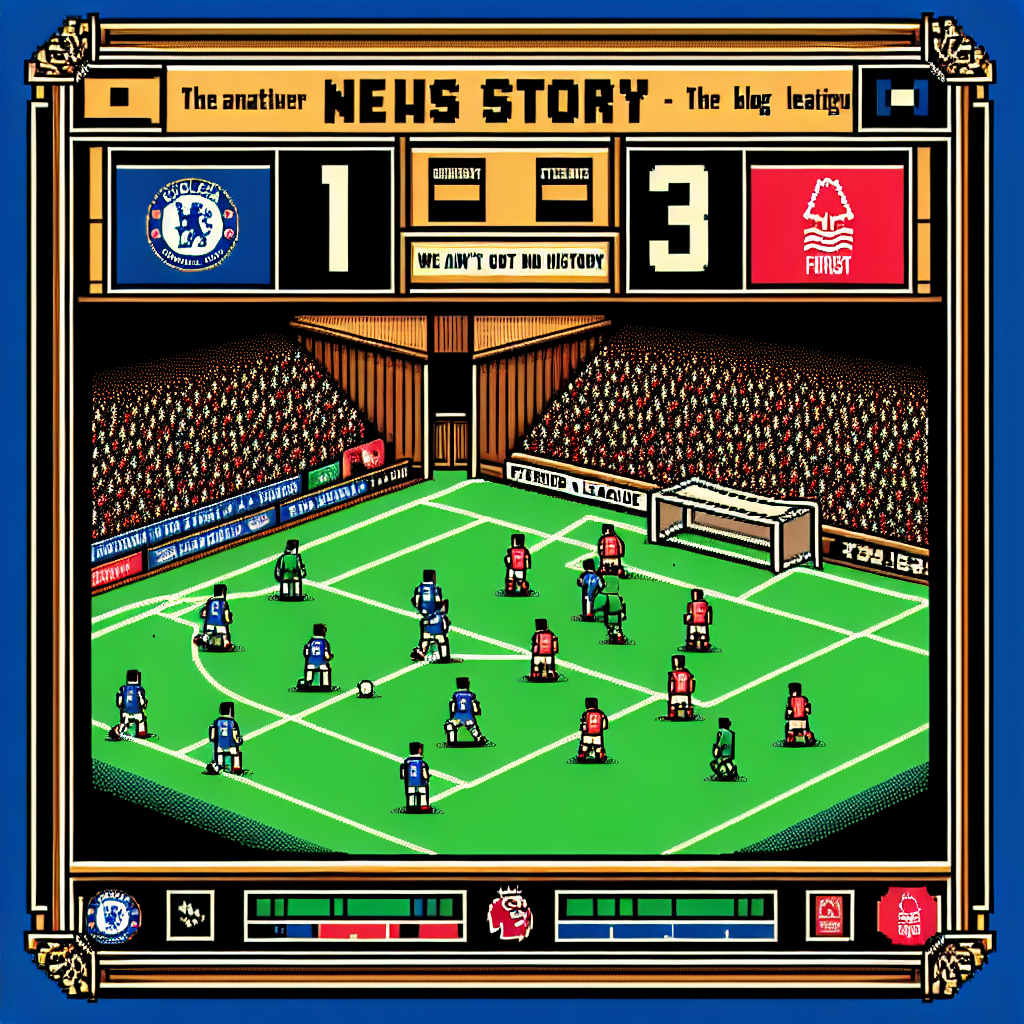
Awoniyi’s brace and a later Igor Jesus strike gave Forest a two-goal cushion they’d defend doggedly. Chelsea’s consolation — João Pedro late on — felt like cold comfort. Moments that should have shifted momentum against Forest instead went awry: Enzo Fernández hit the post, Cole Palmer missed a penalty, and defensive moments were poorly defended at the back post. Small margins, big consequences. (Match coverage and reaction provide details and player ratings.) (skysports.com)

Why “we might be cursed” isn’t just theatrics

Losses happen. But a few patterns amplify that dread:

  • Repetition of the same failings: defensive lapses in set or cross situations, stalled attacking rhythms, and late-game mental lapses have become recurring headlines.
  • Important moments go the wrong way: woodwork, penalties missed, offside whistles — all at times when a swing could have helped. Those events stack and feed the narrative of bad luck.
  • Fan psychology: when a club with Chelsea’s history drops results like this, supporters look for patterns (and scapegoats). “Cursed” is shorthand for systemic issues — chaotic management, shaky recruitment, or tactical confusion.

Watching Forest treat Stamford Bridge like any away pitch and leave with three points fuels that feeling. The result wasn’t a fluke isolated to one bad half — it reflected broader instability across a season. (goal.com)

Tactical cracks exposed

Chelsea’s setup showed good intentions but poor execution. Some of the recurring tactical issues stood out:

  • Vulnerability to crosses: Forest exploited the back post repeatedly. Defending those moments is a mix of coordination and will — both looked absent. (skysports.com)
  • Lack of control in midfield: Without consistent control, Chelsea were predictable. When Enzo had a sight of goal the frame denied them; elsewhere the team struggled to string pressure together. (skysports.com)
  • Rotational headaches: With changes for fixture congestion, cohesion suffered. Debutants and rotated players didn’t knit into a functioning whole, so moments of brilliance from individuals were not enough.

These are fixable problems — but they require a steady plan and clear leadership. Short-term motivational speeches don’t rewrite structural problems.

The fan reaction and the narrative of doom

Fans responded with a mixture of anger, sorrow and gallows humour. Social feeds were awash with disbelief: booing at full-time, memes about the club’s decisions, and chants that blended nostalgia with fury. The “we might be cursed” line spread because it captured something wider than this single defeat: the sense that decisions off the pitch are producing results on it.

That perception matters. Club morale, public confidence and player psychology are mutually reinforcing. When supporters believe the club is adrift, those narratives leak into media and can even affect player performance. It becomes harder to break the cycle. (reddit.com)

What this means for the rest of the season

Pause and breathe: one loss doesn’t end seasons, but its timing can be toxic. A home defeat like this:

  • Damages hopes of a top finish or European qualification.
  • Puts pressure on the manager and the board if the results pattern continues.
  • Forces tactical and squad reassessments before the summer.

If ownership and coaching staff respond with coherent fixes — clear transfer targets, tactical clarity, and a commitment to stability — this can be a wake-up call rather than a crisis. If not, the “cursed” vibe hardens into institutional rot.

Takeaways from a messy night

  • Momentum and intent mattered: Forest played with survival-level focus; Chelsea did not match that intensity.
  • Small margins defined the match: woodwork, a missed penalty and poor defensive reads amplified the scoreboard.
  • The story is systemic: repeated patterns this season make the loss feel like more than bad luck.

My take

“We might be cursed” is a dramatic but useful shorthand. It captures emotions when fans see the same mistakes over and over. But luck only explains so much. What’s most worrying is the repeatability of these errors — tactical confusion, poor defending of crosses, and moments where the team looks short on belief.

Fixing this requires clarity and consistency: a tactical identity that players understand, smarter game management, and recruitment that addresses real weaknesses. Fans might use the curse line to cope, but the cures are mundane and managerial.

Final thoughts

Football has a way of turning narratives on their head in weeks: confidence can return, and a run of form can make this loss a blip. Equally, inertia and poor decision-making can make the same pattern persist. For Chelsea, the urgent task is to turn the “we might be cursed” chat into a list of concrete fixes — one training session, one clear instruction, one transfer at a time. Until then, Stamford Bridge will feel prickly after nights like this.

Sources


Related update: We recently published an article that expands on this topic: read the latest post.


Related update: We recently published an article that expands on this topic: read the latest post.

Rockies Roast Mets: Queens Sweep Shame | Analysis by Brian Moineau

When trolling becomes a storyline: Rockies prolifically troll reeling Mets after doubleheader sweep in Queens

The Mets have become an easy mark on social media these days as their dreadful 2026 season continues — and nowhere was that more obvious than after the Colorado Rockies completed a doubleheader sweep at Citi Field. What began as a rain-delayed Sunday quickly turned into a social-media sideshow: the Rockies won both games, served up bite-sized graphics and one-liners, and let the internet amplify every miserable Mets moment.

This post walks through the on-field collapse, the off-field chirping, and why this particular sweep feels like more than just two losses. Along the way I’ll unpack the narratives that are forming around New York’s early-season slide and why fans — and opponents — are having a field day.

How the doubleheader unfolded and why it stung

First, the baseball: the Rockies swept a three-game series in Queens on April 26, 2026, after a makeup doubleheader produced 3-1 and 3-0 wins. Colorado’s starters dominated, combining for a stingy ERA and keeping the Mets’ lineup largely silent. Chase Dollander pitched seven scoreless innings in the nightcap, turning in one of the more impressive outings of the young season and shutting the door on any hope of a Mets comeback. (foxsports.com)

Second, the math: the sweep dropped New York to a very ugly record (sitting 9-19 after that series), which only worsened the perception that this team is teetering. When a team hits double-digit games below .500 in late April, narratives harden fast. Headlines and social feeds moved from concern to mockery in a matter of hours. (fingerlakes1.com)

The trolling: not subtle, and wildly effective

The Rockies leaned into it. Social posts from Colorado’s official channels — playful graphics, cheeky captions (including a riff on “New York State of Mind” with “Sweep State of Mind”) — turned a three-game road sweep into a trending topic. Opponents poking fun at struggling teams is nothing new, but the mixture of timing (right after the doubleheader), the wording, and the Mets’ ongoing slide made the posts land especially hard. (aol.com)

Why it resonated:

  • It’s cathartic. Fans love schadenfreude, especially when the target is a high-profile, big-budget franchise.
  • The Mets’ offseason moves had promised defensive stability and run prevention; failing to deliver made the bite feel earned.
  • Social media compresses context into memes — and memes spread faster than explanations.

Context: this isn’t just one bad weekend

To understand why the sweep sparked such noise, consider the broader arc. The Mets’ roster changes and managerial decisions created expectations of improvement. Instead, a long losing stretch — 15 losses in 17 games at one point — made every subsequent stumble look like proof of a deeper problem. The team’s pitching staff and lineup both offered maddening inconsistencies, and sweeps like the one by Colorado feed the “collapse” narrative. (heavy.com)

Meanwhile, the Rockies aren’t a marquee powerhouse; they were below-average in recent seasons. That’s what makes the sweep sting: getting humiliated by a team that was supposed to be an easier out amplifies fan frustration and rivals’ mockery. Sports fans love underdog wins, but they especially love seeing a giant stumble on a small stage.

The social-media mechanics that amplify defeats

Sports teams today are brands — and social-media departments know how to monetize moments. Quick graphics, clever copy, and a tweet at the right time can turn a win into a viral moment. The Rockies played that game expertly: they didn’t rant or gloat for hours; they posted tight, sharable content that fit the story the internet wanted to tell. That kind of precision matters.

Moreover, content creators and opposing fans amplify everything. Within minutes, Mets losses become reaction videos, meme threads, and sports-talk fodder. Once a narrative like “Mets are an easy mark” takes hold, it feeds itself: every subsequent misstep collects more evidence, making the trope stickier.

What this means for the Mets (and why it’s not the end)

Losing and getting roasted online isn’t the same as being out of contention. Baseball is a long season; teams rebound all the time. However, two realities matter:

  • Confidence and clubhouse morale can be fragile. Extended slumps often require managerial adjustments, lineup tinkering, and sometimes roster moves.
  • The optics affect everything from ticket sales to national headlines. For a big-market club, perception creates pressure — internal and external.

So yes, the trolling is a symptom of poor results, not the disease itself. The cure is simple in theory (better pitching, timely hitting) but hard in practice. If the Mets can stabilize starting pitching and find consistent offense, the social-media narrative will flip — fast. For now, the Rockies’ posts are a reminder that in 2026, one bad weekend can earn a team a full season’s worth of jokes.

Key takeaways from the sweep and the social fallout

  • The Rockies’ doubleheader sweep at Citi Field on April 26, 2026, magnified the Mets’ early-season struggles and opened them up to widespread online ribbing. (foxsports.com)
  • Social media turns timely wins into trending stories; Colorado’s marketing hit the tone and timing perfectly. (aol.com)
  • Poor results on the field create cascading problems off it: narrative momentum, pressure on personnel, and fan frustration. (heavy.com)

My take

Sports are messy and emotional; that’s part of the allure. The Rockies did what every good competitor should: they won when it mattered and then leaned into the moment. The Mets, meanwhile, are paying for an uneven start. If you’re a neutral, it’s entertaining. If you’re a Mets fan, it’s excruciating — and fair to say, the jokes will keep coming until the team gives them nothing to work with.

But take a breath: seasons aren’t decided in April. Teams rally, slumps end, and narratives reverse. Still, until that turnaround arrives, expect the social-media beatings to continue — because when a big-market team struggles, the internet rarely shows mercy.

Sources


Related update: We recently published an article that expands on this topic: read the latest post.


Related update: We recently published an article that expands on this topic: read the latest post.

Ravens’ Next Flight: Sleek Helmets, Bold | Analysis by Brian Moineau

A new look for Baltimore: The Next Flight takes off

The Next Flight uniforms introduce two new helmets and several sleek changes in the details. The Ravens’ long-awaited refresh landed like a thunderclap: not a total reinvention, but a confident evolution—cleaner lines, bolder accents and a pair of helmets that immediately dominated the conversation. For a franchise that’s worn purple and black for 30 years, that’s precisely the kind of change that gets fans’ hearts pounding and wardrobes updating. (baltimoreravens.com)

Why this matters beyond the colors

Uniforms do more than clothe players; they tell a franchise’s story. The Ravens leaned into motifs tied to Baltimore—wings, talons, and subtle flag references—while preserving the identity that worked on the field and in the stands. The result feels intentional: familiar at a glance, but with details that reward a closer look. The club said the process took years, and you can see that in the layered touches and refined typography. (baltimoreravens.com)

The Next Flight uniforms: helmets, jerseys, and details

  • Two new helmets headline the collection: a matte-black “Darkness” helmet and an updated metallic-purple “Purple Rising” shell. The Darkness helmet features black talon stripes and a forward-facing raven logo with red eyes, designed to pair with the all-black alternate uniform. The Purple Rising helmet adapts previous alternate elements into a cohesive primary look. (baltimoreravens.com)
  • Jersey tweaks include an updated number font with a midnight purple stroke, iridescent accents inspired by raven feathers, and a collar pattern that echoes a raven’s wing spread. The white jerseys now display “Baltimore” across the chest, giving the road set a local stamp. (nbcsports.com)
  • Pants and stripes received subtle adjustments: talon stripes appear across pant varieties, and shield patches incorporate iridescent color that shifts in light—small touches with big visual payoff under stadium lights. (baltimoreravens.com)

Transitioning from the familiar to the fresh, the Ravens balanced novelty with continuity.

The helmets: the real conversation starters

Helmets always carry outsized weight in uniform reveals, and Baltimore delivered two distinct personalities. The Darkness helmet is aggressive and theatrical—matte black, understated striping, and a front-facing logo meant to read menacingly when players emerge from the tunnel. The Purple Rising helmet keeps the metallic sheen introduced earlier in recent seasons, but now more firmly ties into the primary identity. Fans and analysts have already split between calls for classicism and praise for the bold alternate look. (nfl.com)

What fans are saying (and why reactions are mixed)

  • Some fans love the Darkness helmet and the all-black combo, saying it’s the kind of showpiece alternate that energizes gamedays.
  • Others worry the dark-on-dark logo work may get lost visually, especially on TV, and miss bolder contrast or a return to retro flourishes.
  • Many applaud the subtle iridescence and the “Baltimore” script on the white jerseys—small choices that speak to place and craftsmanship. (reddit.com)

The truth is in perspective: the design is conservative by modern rebrand standards but smartly detailed. It’s not shock-and-awe; it’s curated refinement.

Where this fits in NFL uniform trends

Across the league, teams are increasingly exploring alternate helmets, metallic finishes, and localized wordmarks. The Ravens’ rollout mirrors that trend: alternates designed for spectacle, with primary sets that maintain brand equity. The NFL’s relaxed rules about helmet combinations have emboldened teams to mix-and-match helmets and jerseys, and the Ravens clearly built flexibility into the Next Flight collection. (news.sportslogos.net)

Design wins and potential stumbles

  • Wins:
    • Cohesion: colors, logos and textures feel purposefully aligned.
    • Detail: iridescence and collar patterns reward fans who study the kit.
    • Theater: the Darkness helmet and “all-black” look deliver visual drama. (baltimoreravens.com)
  • Risks:
    • Contrast: black logos on black helmets may lack pop under some lighting.
    • Expectations: some supporters hoped for a bolder break from past designs and may see the refresh as incremental. (reddit.com)

How the team framed the collection

The Ravens called the project “The Next Flight,” a nod to both legacy and forward motion. Their messaging emphasized history—references to earlier logos and local motifs—while spotlighting the next era on the field. The reveal at a fan-focused event emphasized community, suggesting these uniforms aim to resonate beyond TV shots and into the tailgate culture. (baltimoreravens.com)

What this means for merchandise and culture

Expect a surge in alternate-helmet-related gear and a steady demand for refreshed jerseys. The Darkness helmet and all-black combos tend to sell well; they also create collectible moments. Over time, small design elements (iridescent strips, new font treatments) can differentiate authentic fan gear from knockoffs, and they give players and broadcasters new visual cues that can become iconic. (sports.yahoo.com)

Takeaways for casual and die-hard fans

  • If you want statement pieces: the Darkness helmet and matching kit are the ones to watch.
  • If you prefer classic Ravens iconography: the primary purple set mostly preserves the familiar silhouette with improved detailing.
  • If you collect jerseys: look for alternate drops that highlight the iridescent and talon stripe elements—those are the design signatures that define this era. (baltimoreravens.com)

My take

The Next Flight feels smart because it respects what worked while giving fans new focal points. It’s not a radical rebrand—and that’s part of its charm. The Ravens kept their visual DNA intact and layered in theatrical elements that will age well when used thoughtfully (think playoff nights at The Bank). The boldest gamble—the matte black Darkness helmet—is exactly the kind of polarizing move that can either become a cult classic or a short-lived fad. Either way, it’s exciting to watch a franchise with a strong identity choose refinement over reinvention.

Final thoughts

Uniforms are a language fans speak; small tweaks can feel like major personality shifts. The Ravens’ Next Flight collection walks a fine line between honoring history and creating spectacle. Whether you cheer the Darkness helmet or miss older flourishes, this reveal gives the team new chapters to write—and new looks to win in.

Sources


Related update: We recently published an article that expands on this topic: read the latest post.


Related update: We recently published an article that expands on this topic: read the latest post.